LOOP
Homepage, Navigation, PDP Redesign
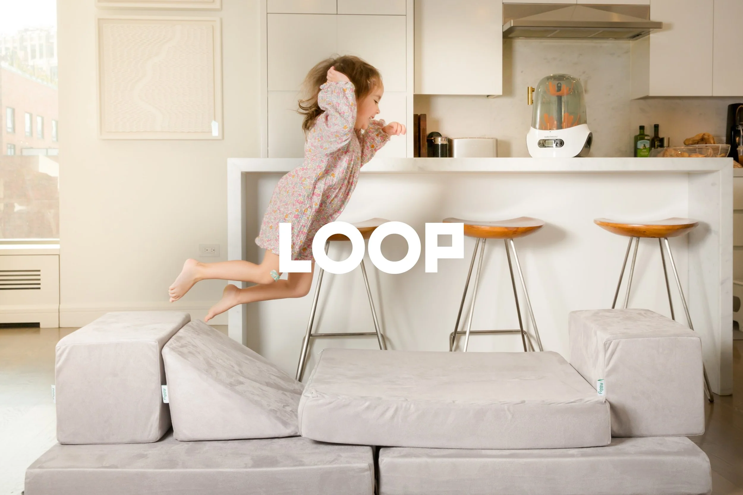
About LOOP
LOOP is a baby gear rental company. They deliver top of the line baby toys and gear that arrives fully-assembled to your door with zero packaging.
Loop sells through an e-commerce storefront and delivers within the New York City Tri-State Area, the San Francisco Bay Area, and Greater Philadelphia
I started consulting with Loop in early 2022 and joined as their lead product designer in the summer of 2022

Project Goals
Bring newly re-platformed Consultant dashboard and customer relationship manager Behind the Counter (BTC) into the app so that consultants can manage their businesses on the go
Thinking mobile first, how can we take into consideration some of the complexities of BTC and create a simplified experience that is optimized for mobile paradigm
Primary Challenges & Considerations
Diversity of user types and ways that they would utilize the platform
Limited resources
Team Composition
I was the only Product Designer at LOOP - I was responsible for all user research, design solution proposals, interfaces from wires to high fidelity, and QA of my work. I worked directly with our CEO and Head of Product.
Small, but agile front end development team of 2
Existing Interfaces
Homepage Existing

Behind the Counter - Re-platformed Desktop Application

Vision & Process

My Goals for the Consultant App
Reach parity with BTC web in regards to features, but re-evaluate how Consultants are using various BTC modules and make sure what we are designing is optimal for the context of mobile
Develop a navigational structure that is simplified and easy to understand, but also scaleable for future BTC additions. Ensure BTC modules are 1-2 taps away at all times
Design an adaptive experience that takes into account the 5+ types of Consultant and their diverse set of needs when it comes to running their businesses
Make sure app follows all accessibility guidelines since 1 in 7 people have a disability or impairment
Incorporate elements of play and delight while enabling in Beautycounter’s unique voice and mission across all touchpoints
My Plan
Test existing interface prior to designing navigational concepts
Test navigational concepts while garnering feedback on current Consultant usage of the app
Once core navigational structure has been designed, move onto BTC modules in an order that makes sense based on mobile usage patterns
Continue to user test and survey
Update shopping experience overtime to make sure it is parity with web experience
Develop set of metrics to continue to monitor post-launch
Proto Personas


Existing App Data
29k downloads (as of April 2019)
AOV $119
8,400 MAU
Average rating of 3.2 Stars on Apple App Store
Access to Mixpanel Dashboards and ability to survey in app


More Process
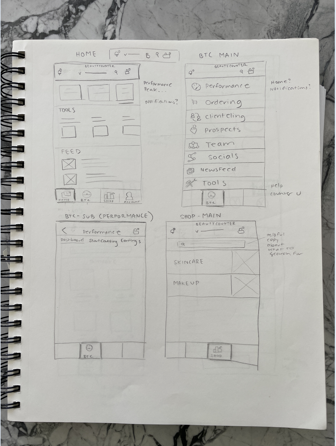
Communicating Design Details - Low Fidelity Sketches


Communicating Design Details - Wireflows

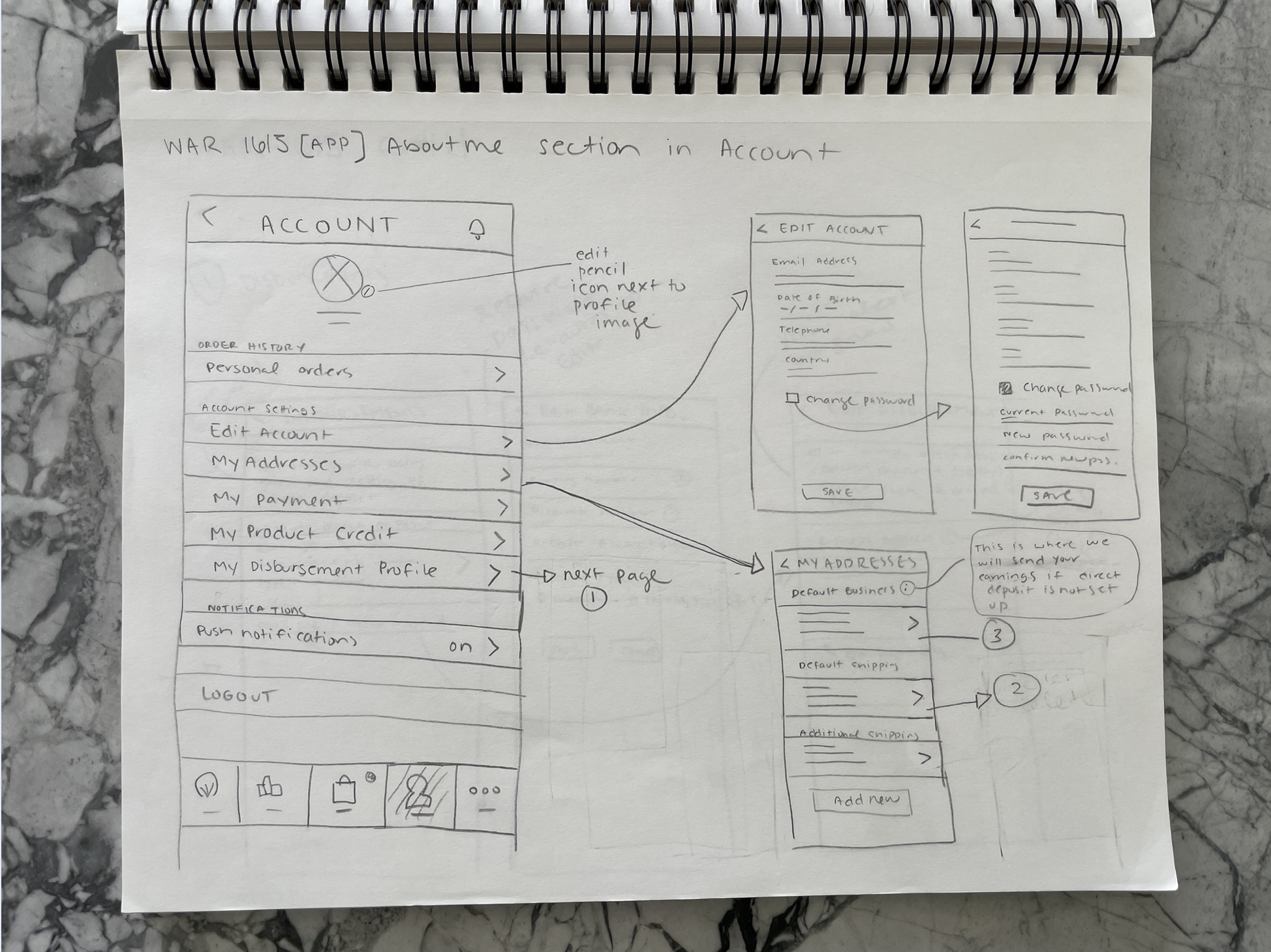
Communicating Design Details - Annotated Wires

Feedback from Initial User Interviews
Spoke with 12 Consultants - Made sure that all levels were represented in user group
All interviewees had used app, but many did not consider themselves as ‘active’ app users
Tools, which was one of the only BTC features included in the app at the time, did not have content of which was easy to share on social media outlets - main outlets included Instagram, Facebook, iPhone Messages App, Twitter
Needed more BTC features in order to effectively manage their businesses on the go
Downline report
Consumer App
Compiled this data with that of results from testing additional platforms (mostly BTC) as well
Redesigning Navigation
Process - Preliminary sketches exploring navigation options


Process - Initial Wires for Testing

Testing Navigation Concepts
User Interviews
Moderated discussions were focused on self reported feedback on existing app features. Goal was to understand general attitudes (needs, motivations, wants, desires) about the Beautycounter iOS application. Spoke with 15 Consultants.
Direct Observation
Provided a first hand understanding of user processes as it relates to an updated navigation concepts and PDP design within the app. Observation made through Lookback program which allowed me to view their screen as they navigated on the prototype.
Recorded sessions and organized responses in Excel

Major Pain Points
Unsure how to share products and social media assets
Lack of motivational content
Some of navigational concepts were difficult to master and not ‘user friendly’
Desired Ability To
Easily reference their current level
See Alerts
See/share client order information and updates
Share links to products with PWS attr’b
Share social media assets
Clear notifications
Search ingredients
Gamified experience like Start Counting


Navigation Winner


Core Feature Redesign - Start Counting
Goals for Redesign
Maintain the gamified/motivational nature of the program
Make sure all technical terminology has a tooltip of translation
Milestones should be easy to navigate
Consultant should be able to reference even after they graduate from program
Solution
Core Feature Redesign - Performance Dashboard

Goals for Redesign
Needs its own dedicated space within the app that is still prominent
Important metrics should be available at a glance, but Consultant should be able to drill down into more detailed metrics as well
Use visualizations over charts as much as possible
Consultant rank vs Paid as rank should be prominent
Different views based on Consultant level
Ideally modules customizable