Product Page Re-Design
Overview
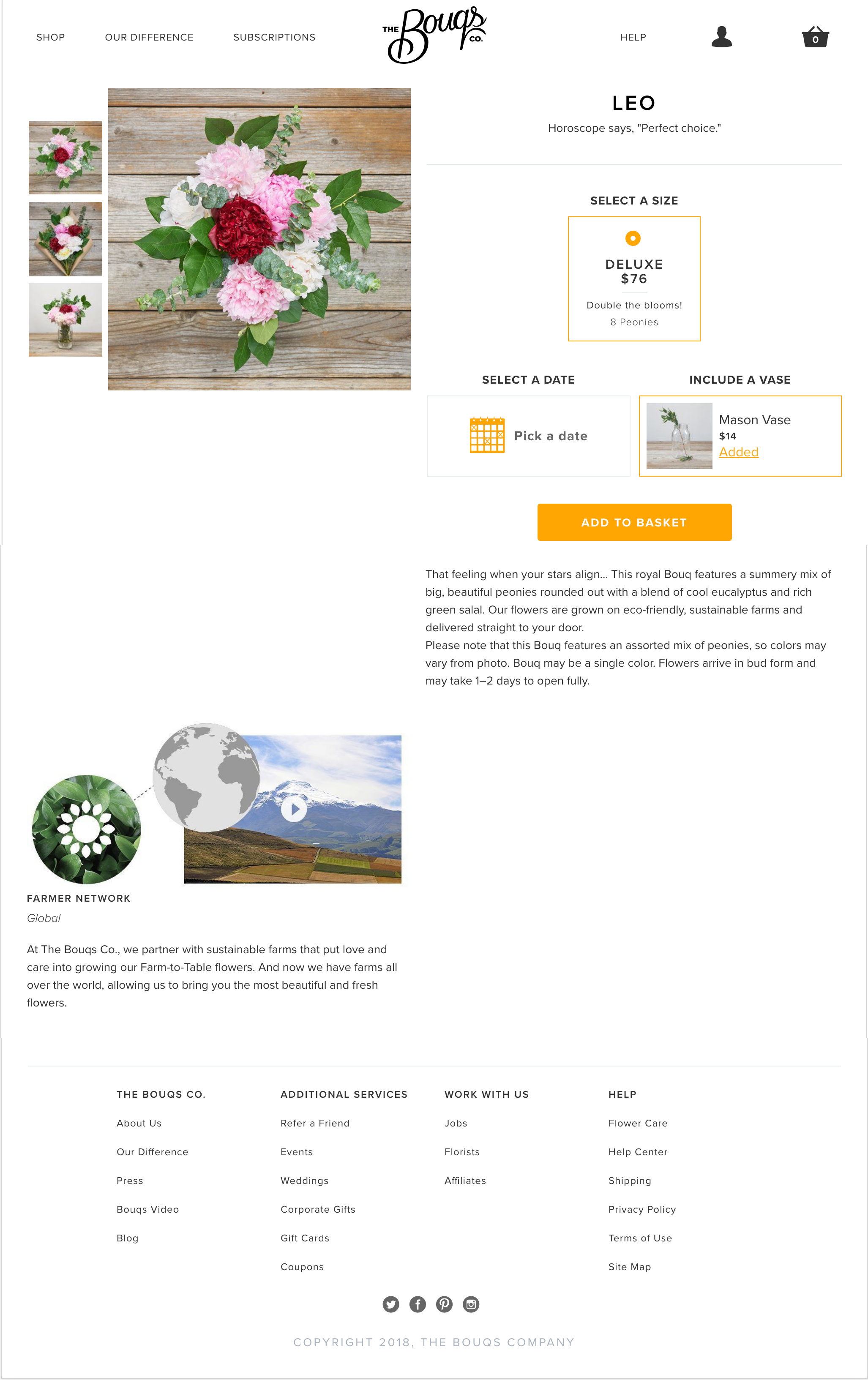
Updated Product Detail Page (PDP) that uses storytelling, rich product imagery, and user generated content to transform a dull catalog page into an engaging experience. Maximizes whitespace to draw attention to key product attributes, and uses imagery to educate shoppers about how their Bouq arrives. User generated content provides powerful validation, especially for first time customers.

The green line at the very top signifies drop off levels on the PDP step in our ecommerce flow. It was even higher than Catalog, and our goal was to change this.
Existing PDP Page Design

More Context
Combatting drop off on the PDP was one of my primary goals during the first quarter of 2018. After watching session replays and evaluating onsite data and our customer acquisition funnel, I pinpointed that drop off on the Bouqs' PDP was significantly higher than comparable ecommerce sites. It was not difficult to see why. The existing page was lackluster at best: the imagery was too small and all of the other content felt hastily placed on the page. My goal was to revitalize the experience in part by enhancing what was already there, while also adding user generated imagery and testimonials. Adding a user generated content section to a product page is so incredibly powerful.
Even though shopping online is more and more mainstream, there is still a bit of anxiety that comes along with buying something from a company for the first time - especially if that item is a gift. User generated imagery - ideally of the specific product - provides a heavy dose of authenticity. Bouqs shoppers in particular spend a significant amount of time analyzing each image, reading each description, and comparing products side by side before they made their selection. This is largely because of the lack of trust that shoppers have towards online flower companies in addition to the fact that most shoppers are buying as a gift - and they will never see what they are actually purchasing.
Preliminary Research


Competitive Research


Sketches to High Fidelity

Proposed Design Updates
High Fidelity UI


Testing
Variant A (Original)

Variant B (UI + UGC)

Variant C (UI + UGC + HIA)

Results
Micro-step conversion rate on mobile devices was 13% higher on Variant C than Original variant (100% certainty)*
Micro-step conversion rate on Tablet & Desktop was 4% higher than Original (99% certainty)
*Note that with mobile because most of this information was beneath the fold, we added a swipe event to the How it Arrives section. These results take into account Shoppers who interacted with the swipe event and moved forward in the funnel.
Iterations
In 2018 there was a company-wide initiative to sell other products and complimentary products to our floral selection. The first thing we prioritized was updating the PDP UI and back end systems to be able to support more than one vase per product. With this iteration we further refactored the UI by moving the ‘Select a Delivery Date’ field to the top of the product options since this was usually the most important thing to a Shopper - if a product wasn’t available on the date they needed, they would most likely not check out with it.


