Product Design Case Study
Redesigning Loop's product experience to convert browsers into subscribers
A research-led redesign of the navigation, catalog, and product detail page — helping families discover the right gear faster and feel confident moving toward rental.
Context
A rental model that needed to earn trust fast
Loop is a subscription service that delivers sanitized, fully assembled baby gear and toys — then picks them up when parents are done. The value proposition is strong, but the existing website wasn't communicating it clearly enough to convert first-time visitors into paying members.
My work sat squarely in the Digital Product & Engineering team's OKRs. The goals were concrete:
Research
Three research streams, one clear picture
Before touching any UI, I ran parallel research across competitive analysis, customer journey mapping, and direct user testing to understand where the experience was breaking down.
I audited 10 direct and adjacent competitors including Babyletto, Lovevery, Nestig, Lalo, Tumble, Docktor, and NextCo — comparing PDP structure, value communication, navigation patterns, and trust-building approaches.
Key pattern: the strongest PDPs front-loaded trust signals and communicated what made their model different within the first scroll.
Mapping the full journey from homepage through account settings revealed two critical emotional tension points: anxiety around item safety and sanitation on the PDP, and anxiety during the waiting period after placing an order.
Moderated sessions across key pages surfaced consistent friction — especially on the PDP and Plans pages where purchase intent is highest.
Data
Heatmaps confirmed what testing suggested
Layering in heatmap and scroll data from the existing PDP validated qualitative findings — and revealed a critical mobile problem: trust content was falling below the fold on the device most likely to convert.
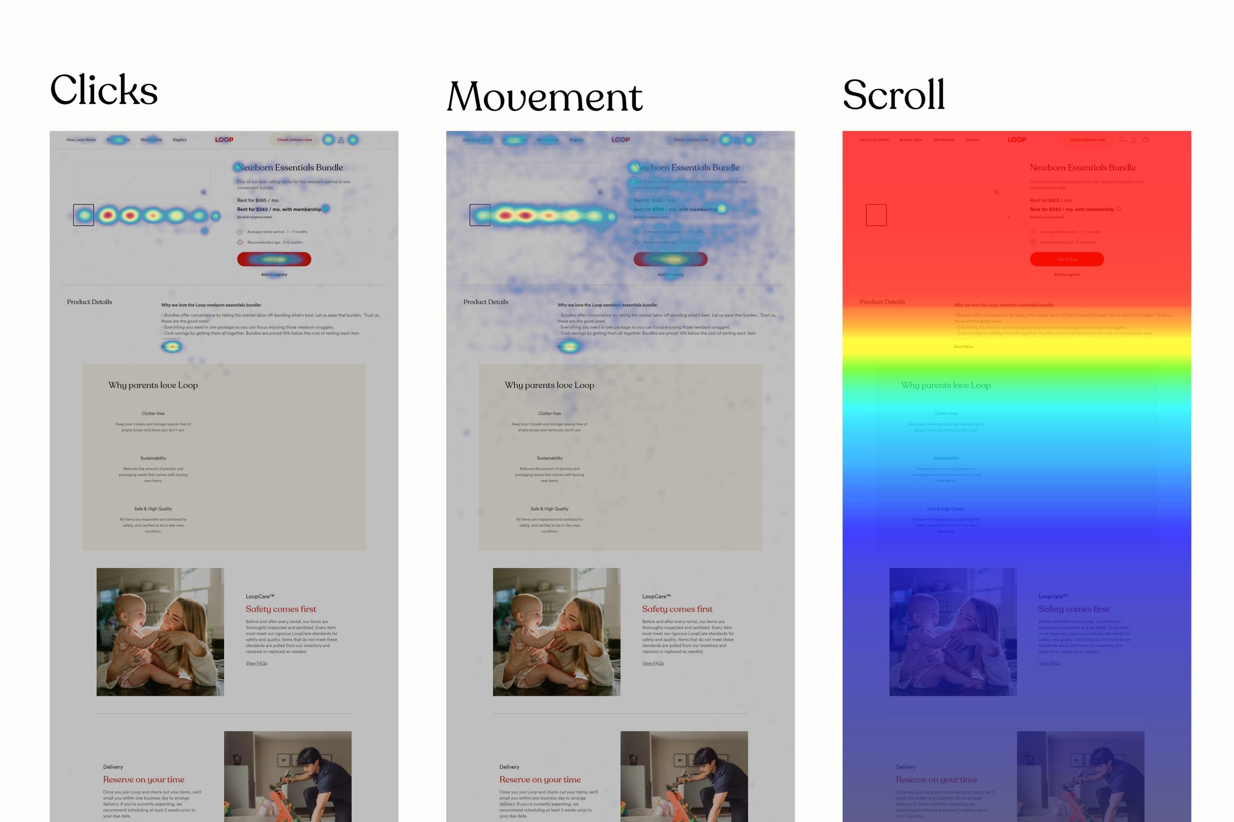

Desktop avg fold at 798px · Mobile avg fold at 682px. Click concentration was highest around the CTA and pricing — but scroll depth dropped sharply below the fold on mobile, meaning the LoopCare and Delivery sections were almost never seen on the device most likely to convert.
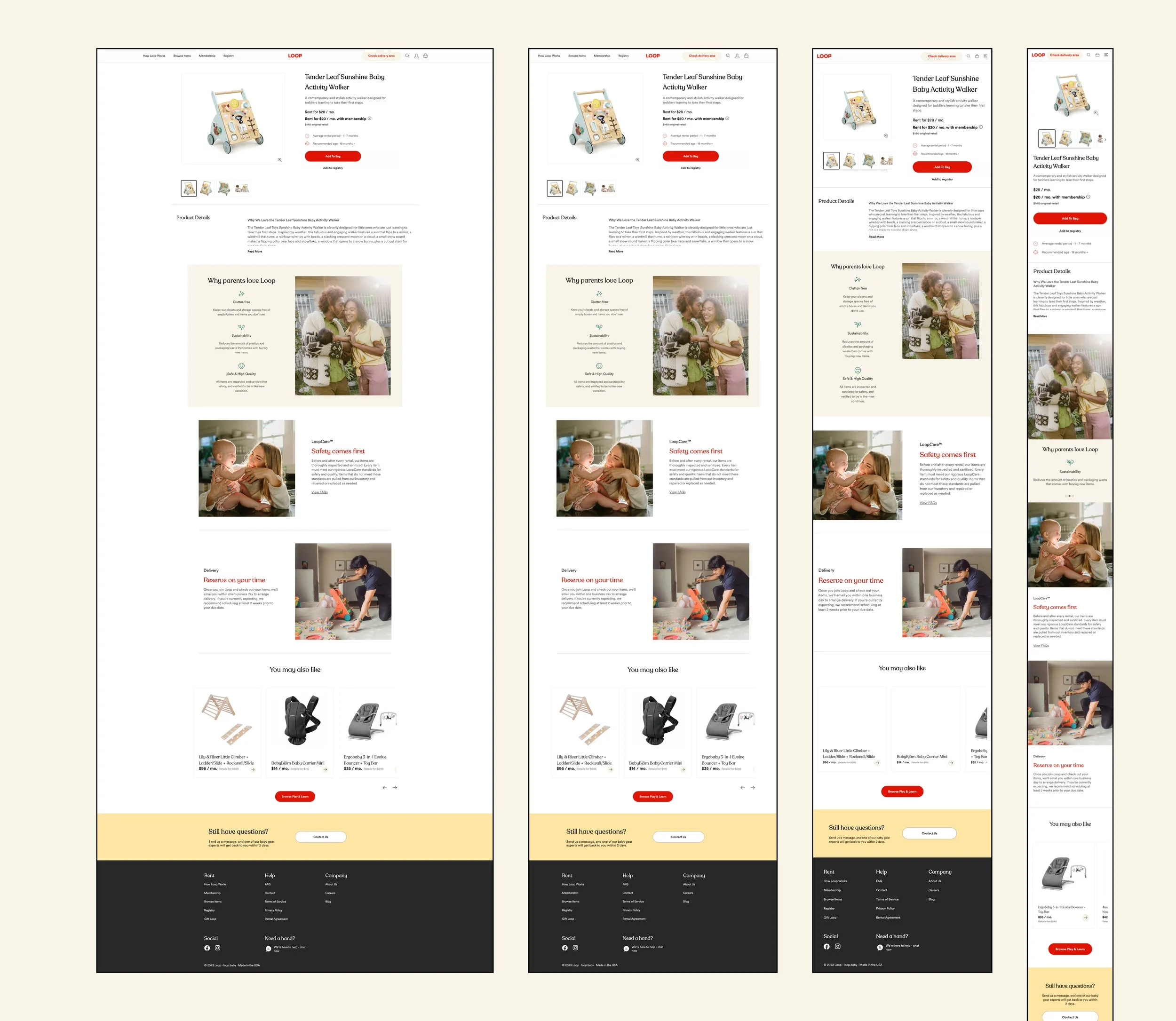
Existing UI
Where the baseline fell short
The existing PDP and navigation worked as a functional starting point — but structural issues compounded the trust and conversion problems the research had surfaced.
Redesign
Four recommendations, implemented
Research led to four clear design directions, each directly tied to a specific finding. The redesign addressed all of them across navigation, catalog, and the PDP.
- 1Strengthen the rent-vs-buy value frame. Rewrote pricing copy and hierarchy so the membership saving and rental model are immediately legible — before users reach the CTA.
- 2Surface LoopCare above the fold on mobile. Moved safety, sanitation, and quality assurance content higher on the PDP so it's seen before users decide to scroll — or don't.
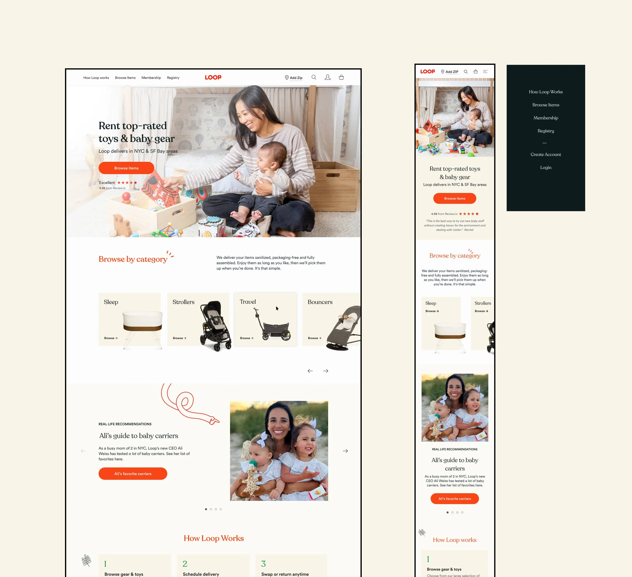
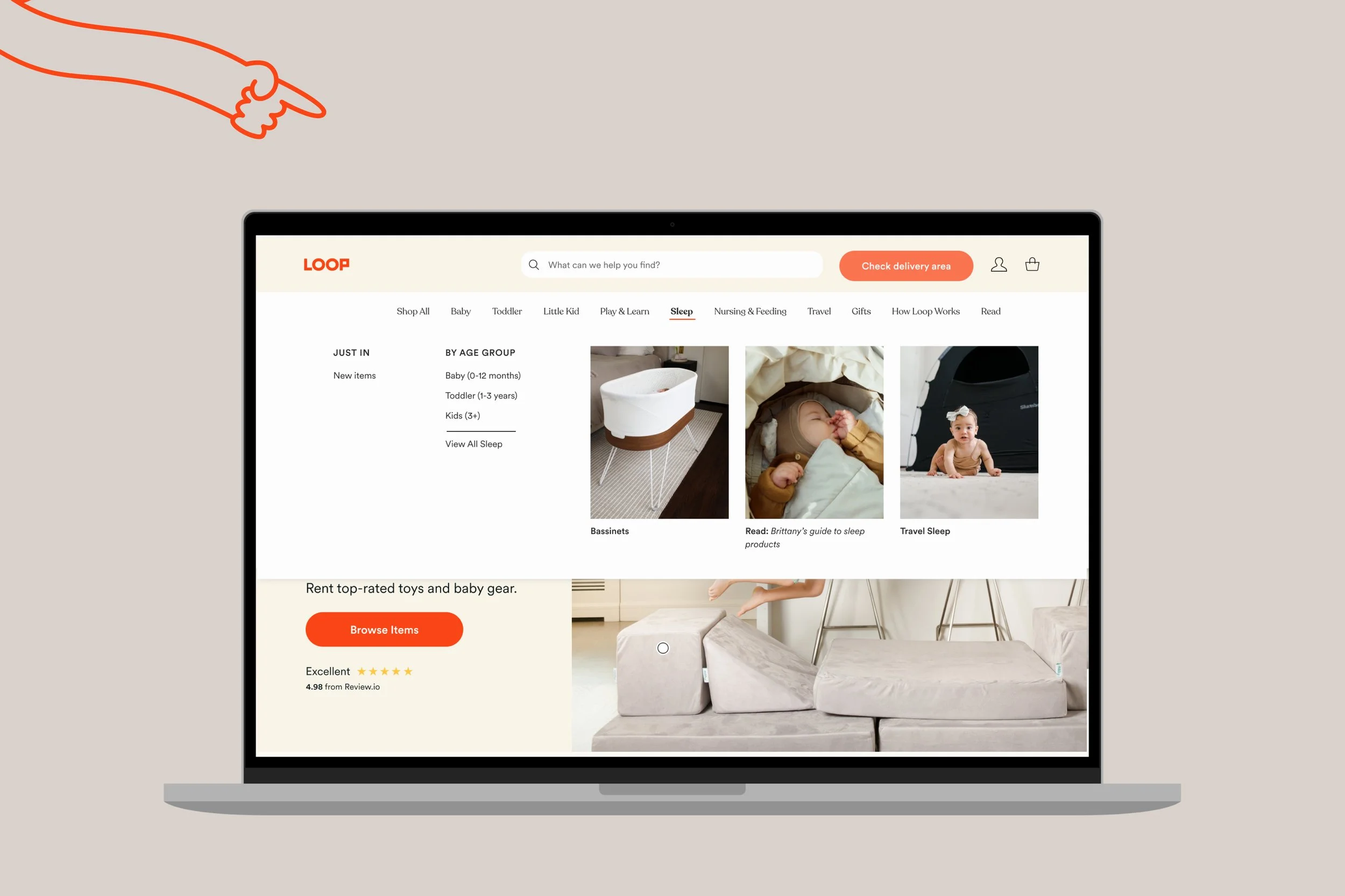
- 3Redesign filter and navigation architecture. Restructured navigation around life stage and need (Baby, Toddler, Little Kid, Play & Learn) rather than internal inventory categories — matching the mental models users described in testing.
- 4Communicate scheduling and delivery expectations clearly. Added delivery timeline and scheduling info to the PDP so users feel confident before adding to bag — not anxious after.
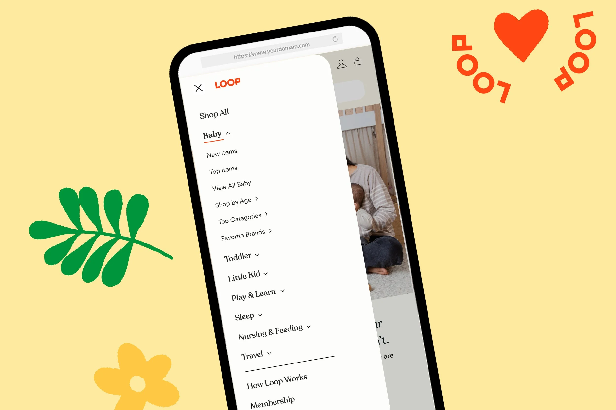
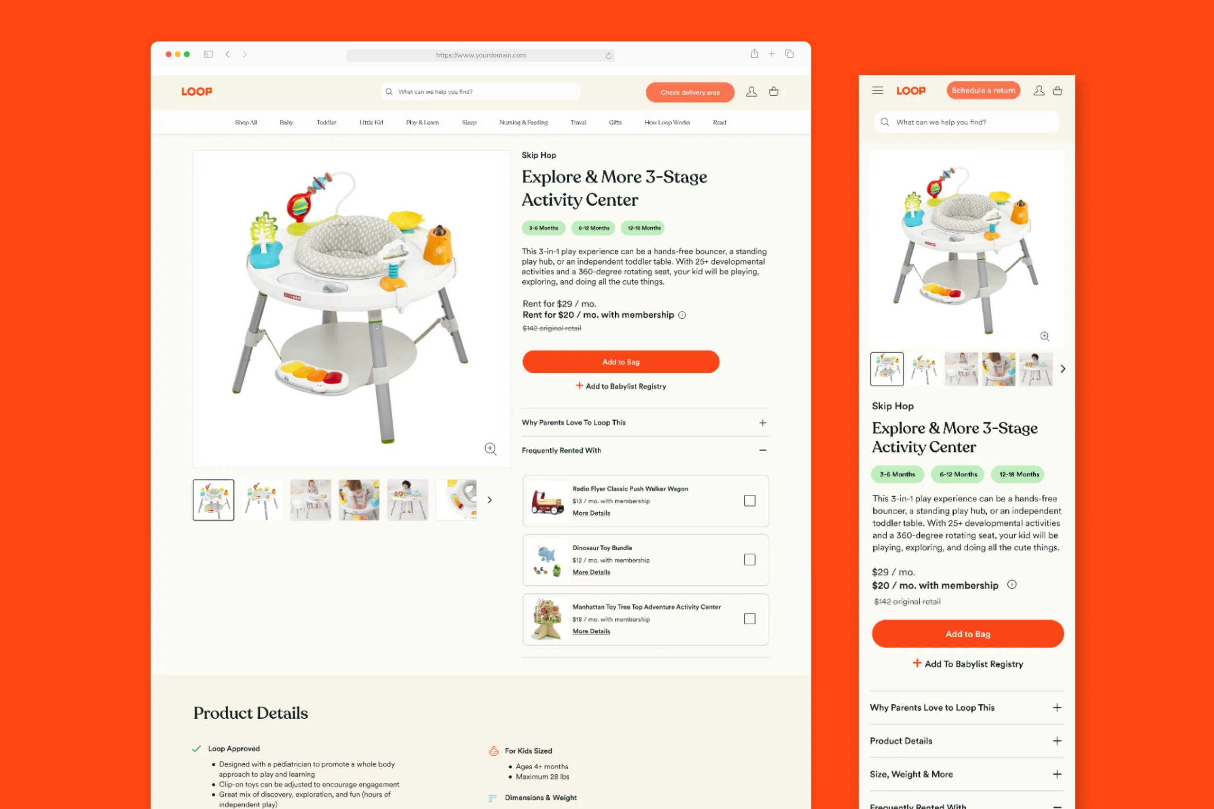
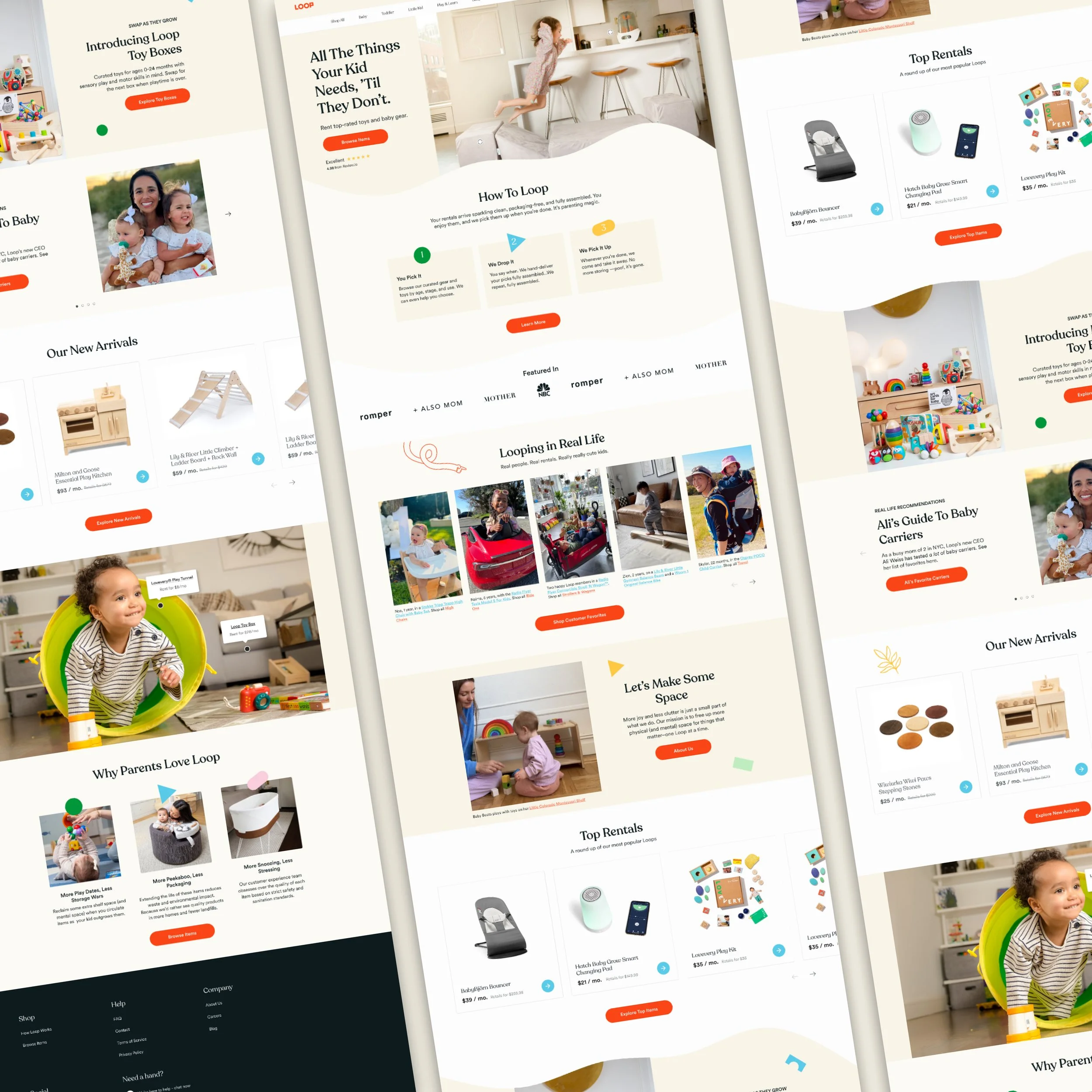
The redesign introduced a structured navigation system organized by life stage, and a "pillar" PDP format that scales across breakpoints — keeping trust signals, pricing, and the CTA within the first scroll on every device.
Outcomes
Results that moved the metrics that mattered
The redesign improved two key parts of the new-customer journey: movement from homepage discovery into product exploration, and conversion behavior on the PDP.
Reflection
What this project reinforced
The most important decision was treating the PDP as a trust-building surface, not just a product listing. Loop's model requires users to give up buying certainty in exchange for flexibility — that's a higher bar than a standard e-commerce conversion. Every design decision had to serve that ask.
Layering three research methods meant no single finding carried the whole argument. When user testing, heatmaps, and journey mapping all pointed to the same gap — LoopCare content too low, delivery expectations set too late — the redesign recommendation was hard to argue against.