Loop
Redesigning product discovery and PDP conversion for a baby gear rental platform
LOOP is a baby gear rental platform that helps families access high-quality products without the cost, clutter, or waste of ownership.
As Lead Product Designer, I redesigned key parts of the customer journey across homepage discovery, navigation, catalog browsing, and product detail pages. The work focused on helping new customers find the right products faster and feel more confident adding them to cart.
Results
+27% product views from homepage to PDP
+13% PDP-to-cart micro-step conversion


PROJECT SNAPSHOT
Role
Lead Product Designer
Scope
Product strategy, UX audit, information architecture, navigation redesign, PDP optimization, responsive UI, brand refresh support
Primary focus
Improving product findability and PDP-to-cart conversion for new customers
Partners
Product, Engineering, Merchandising, and leadership
Platforms
Responsive web: desktop, tablet, and mobile
BUSINESS GOAL
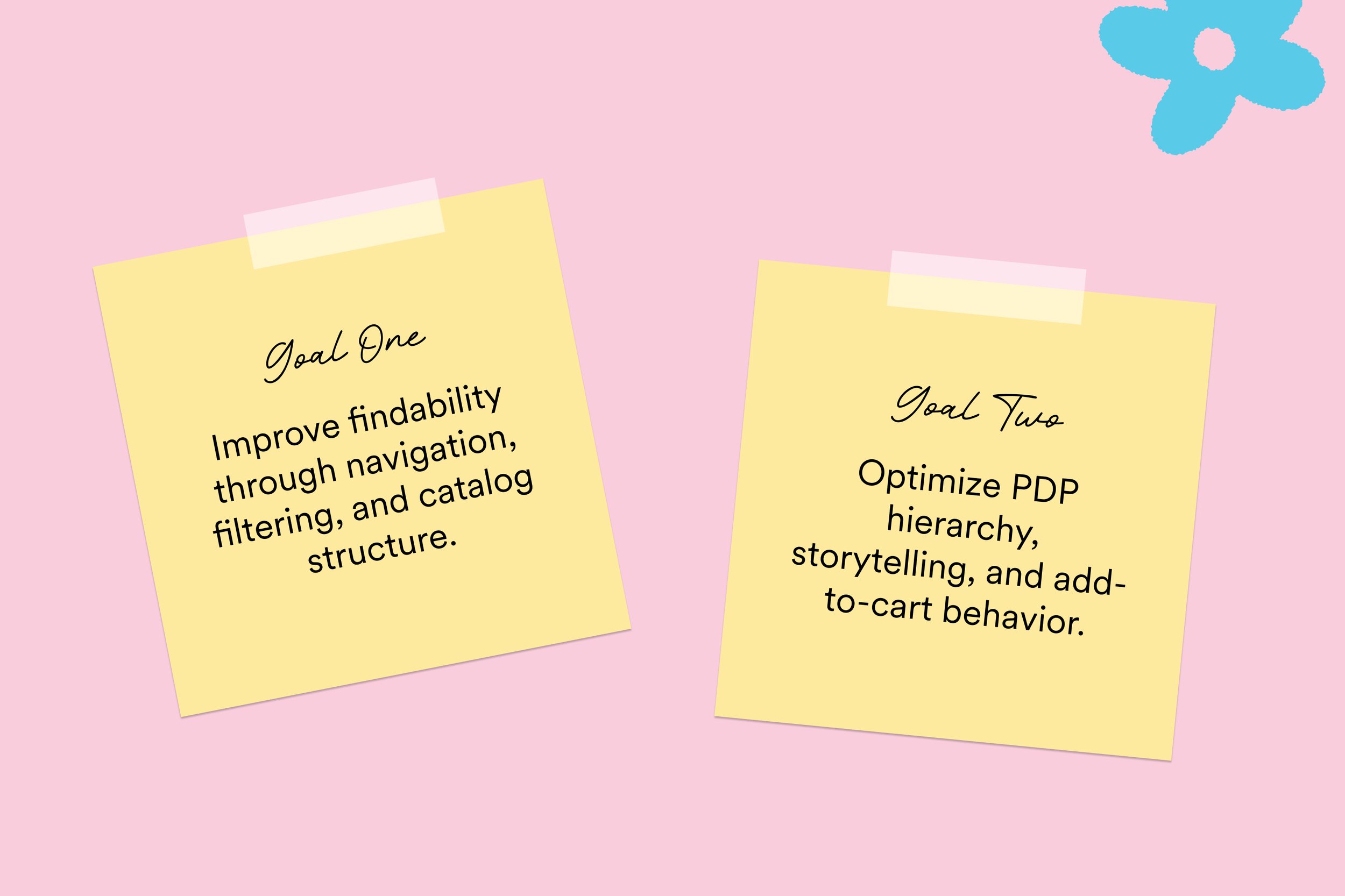
LOOP’s growth goals centered on two moments in the new-customer journey: helping families find relevant products, and helping them feel confident enough to add those products to cart.
The redesign focused on two core opportunities:
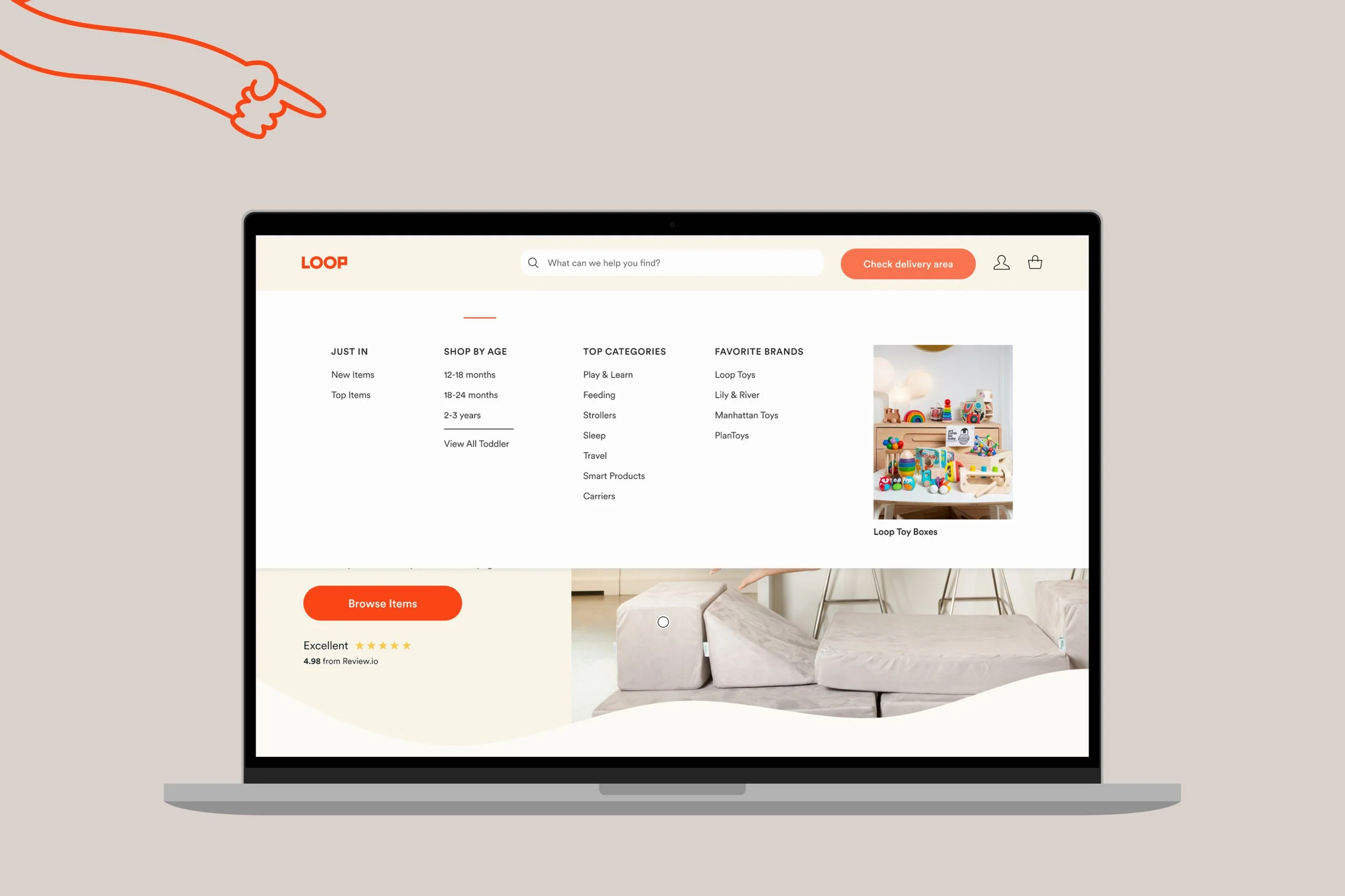
Improve product discovery
Make it easier for customers to browse LOOP’s assortment through clearer navigation, filtering, category structure, and guided entry points.
Increase PDP-to-cart conversion
Redesign high-traffic product pages so customers could quickly understand the product, evaluate rental value, and take action with less friction.
THE CHALLENGE
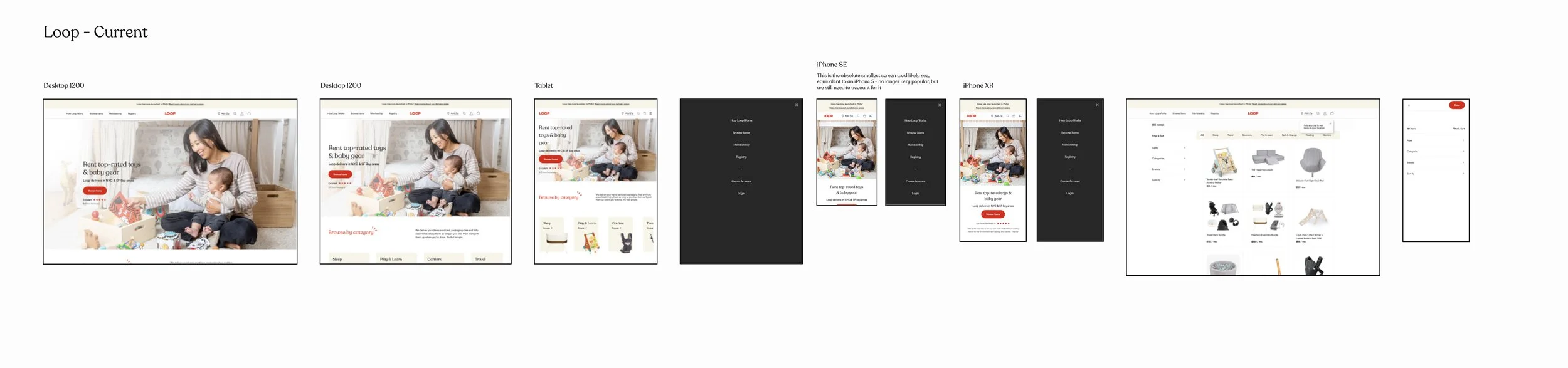
LOOP’s original experience gave customers access to the catalog, but it did not fully support the different ways parents shop for baby gear. Some customers arrived knowing exactly what they needed, while others were browsing by age, developmental stage, travel need, or general recommendation.
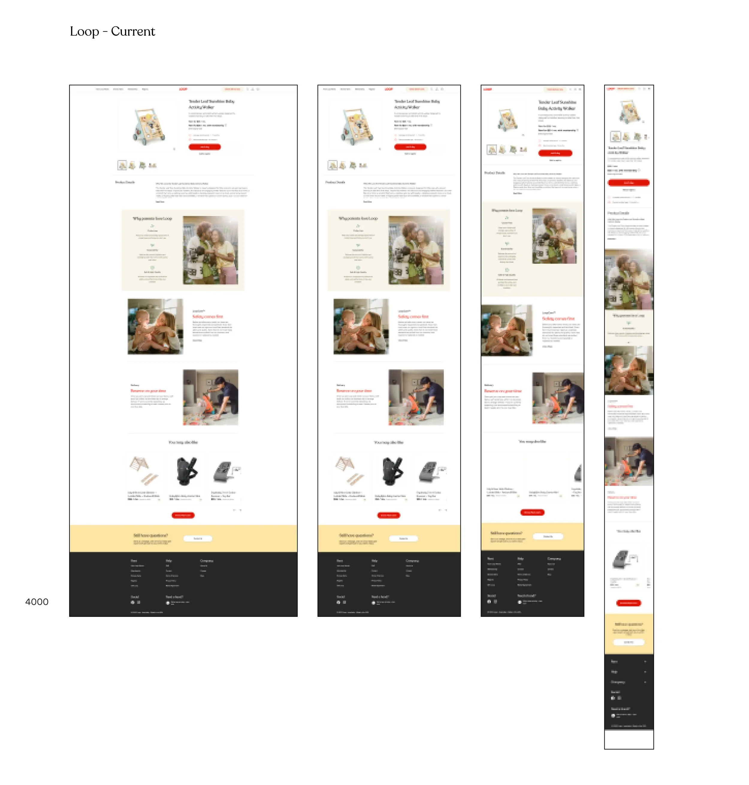
The PDP experience had a similar challenge. Product pages included helpful information, but the page structure was long and content-heavy. Important decision-support content often appeared lower in the scroll, while customer attention was concentrated near the top of the page.
The opportunity was to make the journey feel clearer from the first browse moment through add to cart.